Poster process
The following is the poster creation process of the Quantum Darwinism Beyond Markovian Dynamics. A good resource for making scientific posters is Better Posters.
0. Do research
This is necessary, but does not need to be completed in order to proceed.
1. Have the main text for the poster in mind
Basic components that were quickly jotted down included: title, authors (and their affliations), introduction, theory, model, results, conclusions, with a limit of approximation 200-300 words.
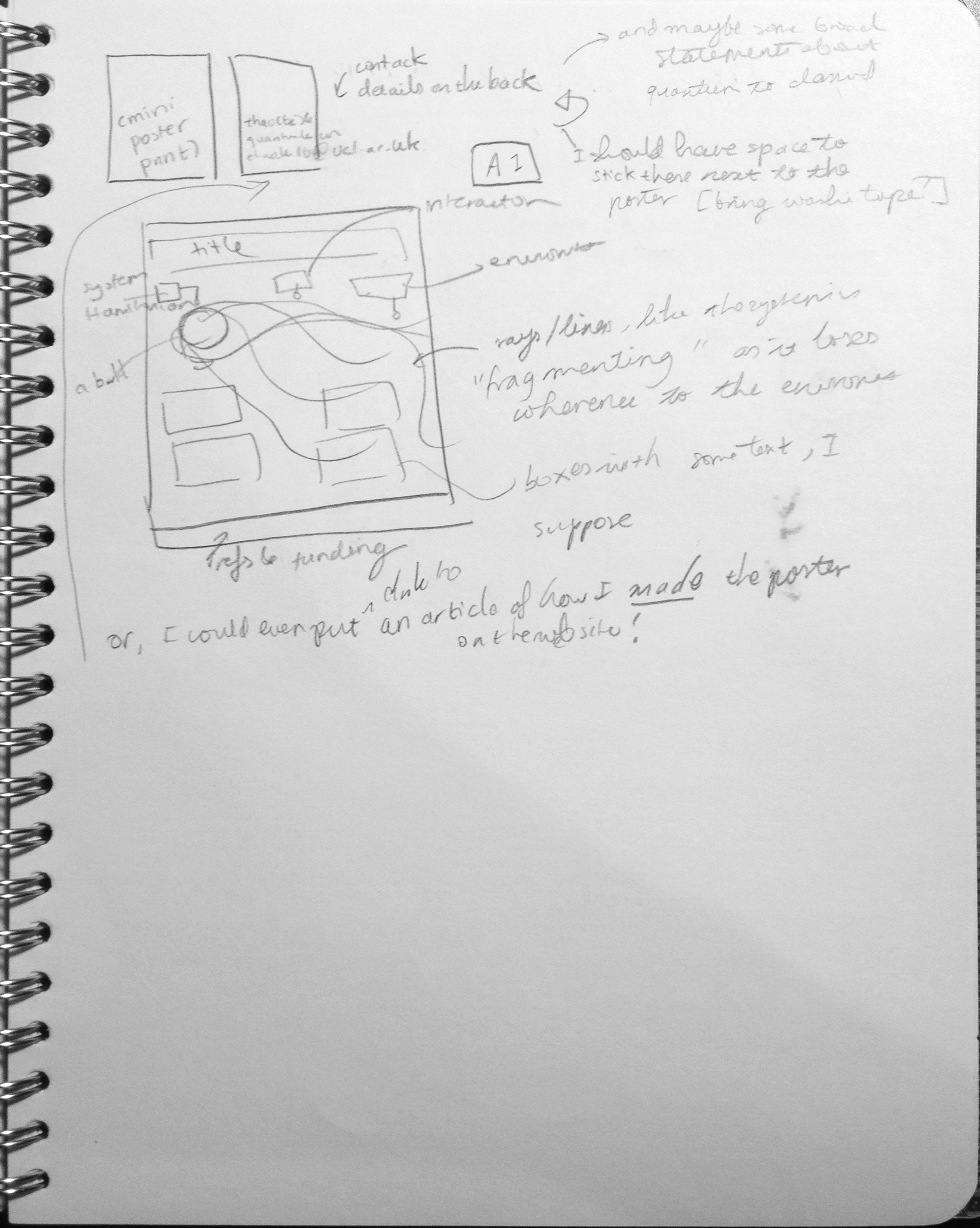
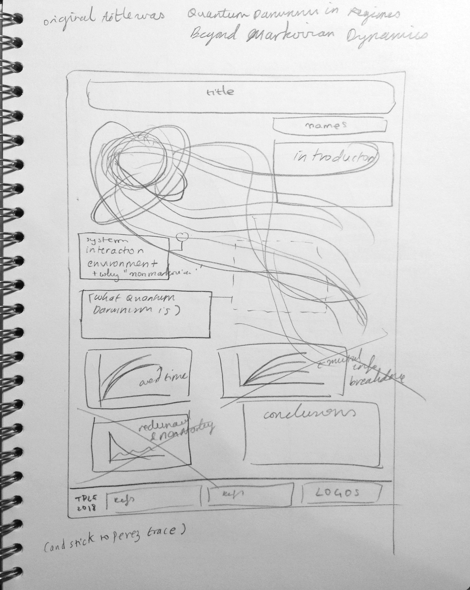
2. Make basic sketches of the poster design
For this particular poster, a preliminary, and then secondary sketch, was made. The focus was on the key positions and sizes of different elements.
3. Construction: Feature image
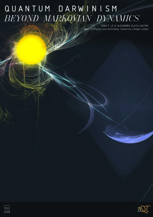
Something on the poster should draw the eye. In this case, it was the title and the background feature image.
The title was made large, and so it had to broken over two lines. To bring attention to the two different topics of "quantum Darwinism" and "beyond Markovian dynamics", two different fonts were used. A good source for free fonts is dafont.com. For a poster, stick a few fonts.
The background image was constructed from various different fractals generated using Apophysis 7X. The fractals were arranged, with colours and other modifications, to produce the following.
The entire poster was made in Adobe Photoshop CS5, at an A1 size. The file size was a few gigabytes.
4. Construction: Content
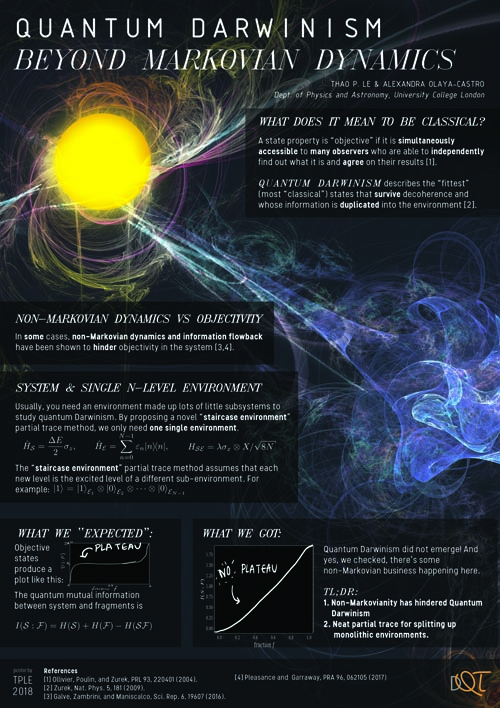
The contents were added relatively quickly, making sure that the feature image was still visible.
At first, "fake" graphs were added in. The maths was added in via the convoluted method of writing up the LaTeX, generating the PDF, and opening the PDF in Photoshop.
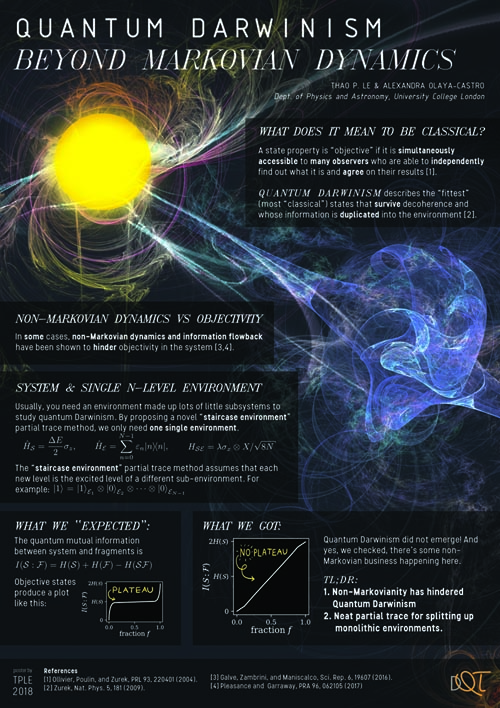
Once overall satisfied, the proper graphs were added. Small re-arrangements were made for aesthetic purposes.
Optional: Get a second opinion
After getting a second opinion, more content was added.
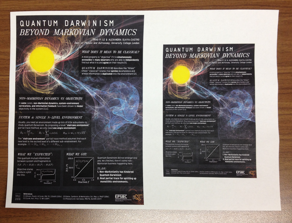
5. The legibility check
A simple legibility check is to print out the poster on either A4 or A5 or A6, and ensure that it is still legible at that size. If it is not, make the text bigger (some unnecessary text may need to be removed). Here, a A5 and A6 check was made--the A6 was
6. Print it
Once that is all fine, the poster is ready to be printed. The following is the final version. The gif shows an coarse-grain snapshot of the different layers in the Photoshop file.


Extra notes
A scientific poster is not meant to be a paper, but more rather an "extended abstract". The link to the actual paper can always be added, and the content can be elaborated in person.